“There are no rules for good photography just good photos.”
– Ansel Adams
Powerful visual storytelling is both art and science. One does not need to follow specific rules to create a beautiful image, but one must first learn to see. A strong understanding of composition fundamentals will help you decide who to use each element effectively within the frame.
Before taking flight, it’s essential to take the time to connect with your surroundings. What story will you tell? What journey will you take your viewer on? How will you capture time, space, and emotion from a 3D world within a 2D image? How will the elements appear from above as compared to ground level? Image composition is your unique creative interpterion of the world around you, so pre-fight visualization is important.
Image composition is simply how the main subject and its surrounding elements are positioned within the frame. Everything within the frame that is not your main subject is called negative space. The treatment of both the main subject and negative space are equally important when composing a powerful image.
There is no right or wrong way to compose an image. However, certain composition fundamentals tend to follow mathematical rules and have a somewhat predictable psychological effect on the viewer. While the elements of composition are the same for ground-level and aerial photography, the difference in vantage point creates very different effects. The drone operator must always consider how objects look from above when framing a shot.
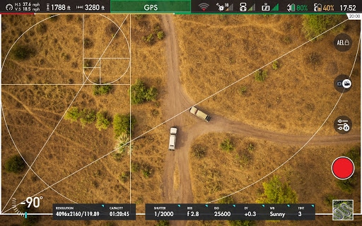
Dating back to as early as Ancient Greece, artists used the Golden Ratio to create works of art. The Golden Ratio, or Phi, exists when a line is divided into two parts and the longer part (a) divided by the smaller part (b) is equal to the sum of (a) + (b) divided by (a), which both equal 1.618. While a mouthful to say, the human brain is intuitively, hard-wired to prefer objects and images that use the Golden Ratio. In nature, things like snail shells and flower petals naturally follow this rule and are aesthetically pleasing.
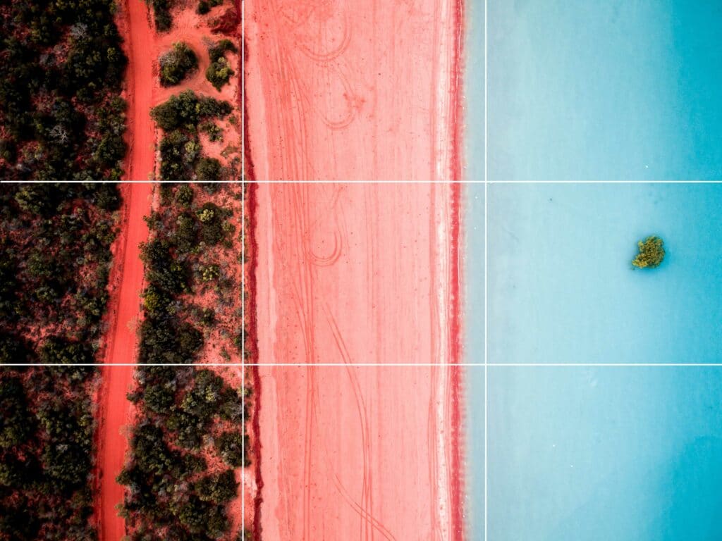
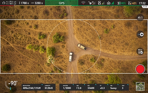
The Rule of Thirds is a simplification of the Golden Ratio and a powerful, common way to compose a photo. Following to this traditional technique, two horizontal and vertical lines are used to divide the frame into equal parts (like an imaginary tic-tac-toe grid).
Positioning the main subject off-center along the intersection of these lines creates an interesting composition. With only 1/3 of the frame filled, the remaining space may feel empty. Balance the image with additional elements in the negative space. Fill the frame with a smaller, secondary object, patterns, or leading lines to fill the frame. The goal is to create a well-balanced image without detracting from the main subject or appearing too busy.
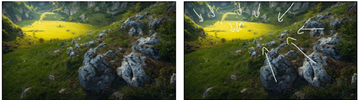
Shape is typically the first element our eyes are drawn to in a photograph. Use interesting shapes formed by treetops, rooftops, lakes, and canyons to crate interest and attention. Circles, squares and triangles are all geometric shapes and have entirely different effects. Create feelings of energy and movement with circles. Use triangles and squares to cultivate feelings of stability.
Shooting from above will also give shapes a much different effect than shooting from ground level. For example, a mountain range shot directly from above creates diagonal lines of stability while shooting from the side can create a feeling of motion across the frame.
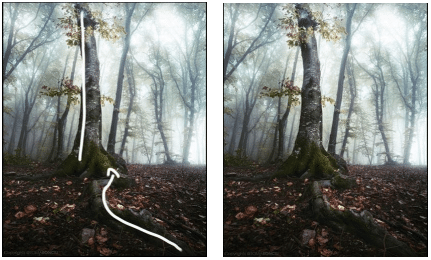
Our eyes naturally follow lines within a frame. Leading lines converge toward the main subject and directs the viewer’s attention to the most important aspects of the scene. From above, roads, power lines, trees, and shorelines produce a sense of movement that act as guidelines.
Placement of the lines creates very different effects. Studies show, we view photos from left to right, the same way most languages are read. Position leading lines on the left side of the frame moving toward the main subject on the right side of the frame to create a powerful experience.
Direction of the lines also changes the effect of the photo. Experiment with horizontal lines that can add a sense of stability to the scene or diagonal lines create tension, depth, and perspective.
You can also grab a viewer’s attention with jagged lines, like stairs. Zig-zagging lines are simply leading lines with breaking points that can add tension and intrigue.
Symmetry can be used within a frame in whole or in parts and can be vertical, horizontal, or radial. Regardless of orientation, symmetry creates a resting point for a viewer’s eye and attracts attention within the frame. From above, rows of trees, or ripple in a pond can create interesting areas of symmetry.
Patterns are created when symmetrical objects repeat more than twice within the frame. Lines and shapes can form interesting patterns and the illusion of texture. For example, repeating lines formed from a planted field or the shape of treetops in a forest can form a pattern. The objects do not have to be identical but should be similar and repetitive.
Breaks in symmetry and patterns have similar effects on the viewer. They create tension and add prominent points of focus for powerful composition.
Aerial photos are impressively grand and expansive but can also lack intimacy and connection. When capturing the 3D world from above, images may fall flat or lack depth. Use color and contrast to create distance and size differentiation between the subject and the background.
A warm-colored subject in the foreground against a bright-colored background brings the primary subject closer, creating a feeling of depth and distance between the two. Bright-colored objects can also appear larger and pop off the page in contrast to a dark background.
Simplifying an image in aerial photography, just like ground-level photography, enhances the photo. Too many elements within a frame can create a busy, scattered, distracted message. Simplification does not mean removing elements from the photograph. Instead, simplification means every element clearly and concisely serves a creative purpose. It is also important to remember that when shooting from above, things tend to appear simpler. For instance, a congested urban area may seem chaotic from ground level, but when shot from above provides a simple background with powerful leading lines. Winding roads can convey a gentle flow of energy. Dense forests can also become the simple backdrop of slightly different shades fall colors. Simple composition is powerful and compelling.
These “Rules” of composition should be considered as general guidelines. They have been proven to be useful when creating powerful images. But, like all rules in life, they can be broken. Some of the most impactful photos are created by artists who did not follow any of these guidelines. You are the creator. You are storyteller. Exercise creative license and use your tools (aka your understanding of composition) to create images that express your unique interpretation of the world.
The creators here at XDynamics understand the importance of photo and video composition and we strongly believe that having a good foundation on composition can make all the difference when shooting on location.
Because we understand this we have implemented multiple different grid layouts featuring the golden ratio, rule of thirds, and more. These grid lines are to help creators frame their setting in the most effective manner.
The grid list includes the following: